
Glaze Reality Check: Why Color and Finish Consistency Is Hard
.png)
Color is one of the most technically challenging aspects of tabletop production
Ask most people to picture a specific blue, and they'll picture one shade of blue. They assume that if you hand a factory that color, what comes back will be that color, every time, across every piece. It feels like it should be simple. The reference is right there.
In ceramics, it almost never works that way.
The color on a finished mug isn't a single decision applied to a surface. It's the end result of a long chain of variables, each one quietly playing a role in how the final glaze reads. The clay underneath it shifts it. The finish on top of it changes it. A few degrees in the kiln move it again. By the time a piece comes out of firing, the color it shows is the sum of every one of those inputs, not just the pigment that went in.
This is the part that buyers and consumers rarely see. They expect exact color consistency, and that expectation is reasonable from the outside. What's hidden is how many process variables stand between a color reference and a finished product. Holding a color steady across a production run, and steadier still across multiple runs or multiple factories, is one of the most technically demanding things that we do.
That's why color management at Magenta starts long before production.
One example is highly sensitive glaze colors like pink, green, and purple. Because of the chemistry behind these pigments and how reactive they are to firing conditions, they rarely reach their target color on the first submission. It's common for these glazes to go through two to five rounds of adjustments before the color is close enough to the approved standard.
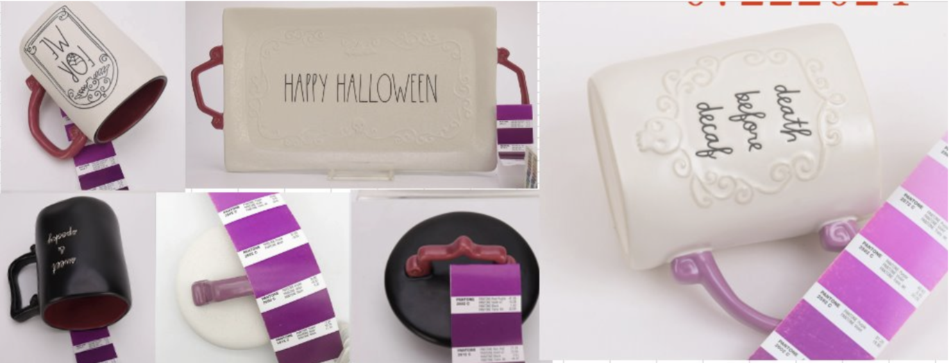
Some programs present an even greater challenge. Our Faux Exposed Clay finish (Pantone 7521C) is often developed across multiple factories at the same time. Although every factory works toward the same color target, slight differences in clay bodies, glaze materials, kiln conditions, and equipment naturally influence the final result. Rather than approving samples individually, we review top-of-production samples from every factory together and only approve production once they fall within an acceptable range of consistency. It's an extra layer of control that helps ensure the product looks cohesive once it reaches the shelf.
Why color is so hard to hold
Color consistency isn't one problem. It's several problems, layered on top of each other, and each one can affect the final result on its own.
Finish type: satin vs. glossy
The same pigment will read as two different colors depending on the finish that is put over it. A glossy glaze reflects light directly, which tends to deepen and saturate a color. A satin or matte finish scatters light across a softer surface, which tends to lighten and mute that same color.
This catches teams off guard more than almost anything else. You can approve a color in one finish, request it in another, and be surprised by how different the result looks, even though the pigment never changed. Finish isn't a cosmetic afterthought that’s applied to a color, it's part of the color itself.
This is why glaze approvals at Magenta are managed separately for each finish type. Even when the target color is identical, a glossy finish and a satin finish will each have their own approved master color standard. Rather than evaluating both against the same reference, each finish is reviewed independently against the standard developed specifically for that surface. It acknowledges an important reality of ceramics: finish doesn't simply change the sheen of a product, it changes how the color itself is perceived.
Clay body
Glaze sits on clay, and the clay underneath influences what you see. Variations in the underlying clay composition can shift how a glaze color reads after firing, especially with glazes that aren't fully opaque. A warmer or darker clay body can pull a color in one direction, while a brighter, whiter body lets it read closer to true.
When the same glaze is applied over different clay bodies, whether across factories or across material sources, the color can drift even though the glaze recipe is identical. The foundation matters as much as the finish.
The influence of the clay body becomes especially apparent with lighter glazes and decorative techniques. For example, a white wax-resist pattern or editorial artwork applied over a lighter clay body produces a cleaner, brighter white. Apply that exact same decoration over a darker clay body, however, and the white appears noticeably softer and more muted. The glaze recipe hasn't changed, only the material beneath it. It's a simple example of why identical formulas don't always produce identical results.

Firing temperature and kiln conditions
Heat is where a glaze actually becomes its color, and heat is never perfectly uniform. Even slight variation in firing temperature affects how a glaze develops and how much depth the final color reaches. Kiln position, atmosphere, and cooling rate all play a part too.
Some colors are far more sensitive to this than others. Certain pinks and reds in particular can noticeably shift with small changes in firing, developing fully in one range and fading or turning in another. A glaze that looks perfect at one temperature can read as a different color a few degrees away.
Batch-to-batch variation
Glaze chemistry is mixed by weight, which sounds precise, and is, until scale enters the picture. Small inconsistencies in raw materials or mixing ratios are easy to miss in a single batch and easy to compound across a large production run. Raw material lots vary. Application thickness varies. Those small differences can add up.
This is why two runs of the same approved glaze, made weeks apart, can arrive with a visible gap between them. Nothing went obviously wrong. The variation simply accumulated.
Production controls and quality expectations
All of these variables can be managed, but only with the right controls in place and the right expectations set around them. Documented color standards, defined tolerance windows, confirmation samples reviewed against an approved reference, and consistent lighting for evaluation are what turn color from a hope into a process.
Just as important is agreeing, up front, on what consistency realistically means. Implementing a tolerance window doesn’t mean that the standards are being lowered. It's simply an honest definition of acceptable variation that protects the quality while still acknowledging that natural materials and high-heat processes will never be perfectly identical. Setting that window early is part of maintaining the quality, and not a compromise to it.
Pink and blue ceramic mugs
Few colors test all of this at once the way a pink does. Here's how it played out across a set of pink and blue mug programs.
The challenge. Across multiple active collections, the same target color was submitted to different factories, and in some cases across different production runs at the same factory. When the samples arrived for review, the variation was visible within the same SKU group. Some pieces came back lighter, some darker. Some read satin, some glossy. Some leaned warm, some leaned cool. Buyers were expecting a single, consistent shelf story. What arrived told several different color stories side by side.
That's a real commercial problem, not just an aesthetic one. A shelf set that doesn't match itself reads as a quality issue to a shopper, even when every individual piece is well made.
The variables at play. When the team looked closely, the spread wasn't random. It traced directly back to the variables that govern glaze color. Satin and glossy versions of the same color reference were producing visibly different results, even with identical pigment. Differences in the underlying clay body were shifting how the color read after firing. Slight variation in firing temperature and kiln conditions was changing the depth and tone of the final glaze. And batch-to-batch differences in glaze mixing were compounding across the larger runs. There was no single cause, just a stack of them adding up, each pushing the color a little further apart.
What early involvement enabled. The reason this became a fixable situation rather than a costly one was timing. The color issues were identified at the sample review stage, before bulk production was approved. That's the window where a color problem is still inexpensive to solve.
With the variation caught early, the team put controls in place. Factories were given documented color tolerance guidelines and were required to submit color confirmation samples against an approved standard, rather than working from a loose reference. Team made a deliberate decision about which finish type to approve as the program standard, instead of letting satin and glossy versions circulate interchangeably. That single choice removed a major source of variation and reduced the resubmission rounds that would otherwise have followed.
The outcome. Once a consistent reference standard and a defined tolerance window were established, color alignment across the multi-factory programs improved significantly. The shelf set began telling one story again. Just as valuable, there were fewer late-stage rejections and less rework cost, because the alignment work happened before bulk production rather than after it. The expensive version of this problem, discovering the mismatch on a finished run, simply didn't happen.
The lesson
Color consistency is a process problem.
It's tempting to treat color variation as something a factory either gets right or gets wrong. But the example above shows that the variation lived across the whole chain…in the finish choice, the clay body, the firing, and the batch mixing…as much as in any single production partner. A factory can execute beautifully and still produce a mismatch if the standard it's working to was never clearly set.
The earlier that color standards are defined and communicated, the less variability ends up on the shelf. An approved reference, a documented tolerance window, a confirmed finish, and confirmation samples reviewed against that standard are what turn a stack of independent variables into a result that holds together. None of that can be added at the end. It has to be built in from the very start.
The takeaway
The expectation of exact, repeatable color is reasonable. What's easy to miss is how much has to go right, and how early, to deliver it.
A finished glaze color is the sum of its clay body, its finish, its firing, and its batch chemistry, evaluated against a standard that either exists or doesn't. Strong color consistency doesn't come from demanding perfection from a factory at the end of the line, but instead comes from understanding those variables early on, setting a clear reference and a realistic tolerance window, and confirming against that standard before bulk production is ever approved.
Done that way, color stops being a gamble that resolves at the sample table. It becomes a process that delivers one consistent story to the shelf.
If you're a retailer, brand, or creator who needs color and finish that hold up across collections and across factories, we'd love to help you set the standards that make consistency repeatable. Explore our partner pathways for retailers, brands, and artists and creators, browse our case studies, or reach out to start the conversation.