Forward Trend Forecast: Summer 2027
.png)
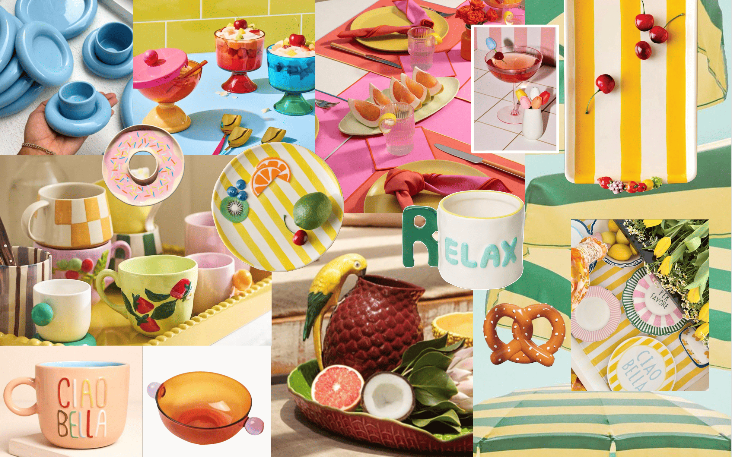
Sun-Drenched Stories for the Table
By Magenta, Inc. Trend Team
Magenta publishes quarterly forecasts 18-24 months ahead, using paid global intelligence and internal design work to translate signals into retail-ready product stories. After sharing with partners, we publish a public edition to advance the conversation and to hold ourselves accountable for what actually arrives on retailer shelves.
____________________________________________________________________________
Across home and tabletop, we see consumers choosing pieces that look collected, touched, and personal. The table becomes a stage for memory, ritual, and a little escapism. Color is present, but intentional. Texture matters more than pattern alone. And the strongest assortments tell a story fast, on shelf and online.
This is the season of Sun-Drenched Stories: countryside charm meets Mediterranean romance, playful maximalism meets soulful craft, and everyday utility gets upgraded into something worth keeping.
"Summer 2027 is not chasing “new.” It is chasing feeling."
The Top 4 Emotional Moments That Will Drive the Trends
Four emotional movements show up again and again across global signals. These are not “themes.” They are buying logic.
1) Bio-Romanticism
Soft, poetic, nature-forward.
Think organic edges, delicate florals, butterflies, ferns, scallops, and sun-faded color that feels lived-in. This direction sells because it reads as calm, nostalgic, and giftable without being fussy.
What it looks like in product: scalloped rims, embossed botanicals, light relief texture, watercolor florals, airy mugs and serve pieces with gentle silhouettes.
2) Slowcraft Revival
Hand-touched forms, heritage cues, and imperfection as proof.
Mineral glazes, exposed clay, folk detail, and texture that signals “made” not “manufactured.” This is where craftsmanship becomes the differentiator even at accessible price points.
What it looks like in product: reactive glazes, matte and speckle finishes, carved or stamped motifs, pottery shapes, artisan-looking sets that still stack and ship well.
3) Elevated Everyday
Warm minimalism meets refined utility.
Quiet luxury is not going anywhere. Summer 2027 pushes it into tabletop through clean silhouettes, sculptural serveware, and pieces that feel designed without feeling precious.
What it looks like in product: Japandi influence, tonal palettes, modular sets, nested bowls, soft geometry, simple shapes with one elevated detail (rim, glaze, foot, handle).
4) Dopamine Tablescape
Joy, nostalgia, and expressive styling.
This is the “more is more” counterbalance. Playful motifs, bold color, figural ceramics, and statement pieces built for social sharing and self-expression.
What it looks like in product: retro prints, novelty icons, bright glazes, mixed patterns, collectible mugs, coordinated micro-collections.
.jpeg)
These four movements are the inputs. They show us what people will be drawn to emotionally and what will convert at shelf.
Next, we translate those inputs into retail-ready product stories. Each story is a shoppable point of view with its own palette, motifs, finishes, and hero items, so buyers can build assortments that feel cohesive while still giving customers variety.
5 Key Product Themes
The stories below are the how: the specific, shoppable worlds those emotions create on the table.
1) Cottage Revival
Countryside nostalgia, modernized.
Naïve florals, prairie cues, garden icons, gingham, birds, bees, and farm motifs land with warmth and humor. The commercial edge is in the finish. Rustic can still feel elevated when texture, glaze, and silhouette are done with restraint.
Retail strength: everyday + seasonal flexibility. This story can live in spring-to-summer, kitchen, and gifting. Product cues: reactive glazes, beaded rims, exposed clay, embossed botanicals, vegetables and garden icons used sparingly as “hero pieces.”

2) Jam Girl Summer
Berry-picking sweetness and handmade ritual energy.
This is cottagecore with a fresher face. It is nostalgic, but not childish. It sells because it is instantly readable and emotionally specific.
Retail strength: highly giftable and seasonal without being date-stamped. Strong summer tabletop and hostess-gift opportunity.
Product cues: painterly florals, ric rac-inspired trim, soft emboss, organic shapes, gentle shine and matte mix.

3) Luminous Joy
Optimism you can feel.
This story leans into glow, sparkle, and layered color. It is about elevating the everyday with pieces that brighten a kitchen and photograph beautifully.
Retail strength: strong impulse. High gifting potential. Big payoff from small footprints (mugs, small plates, trinket dishes, mini serve).
Product cues: glossy brights, translucent-looking effects in glaze, pop-color handles, playful decals, light-catching textures.

4) Summer Rewind
Playful maximalism at full volume.
Pattern-on-pattern, bold shapes, stacked sets, and statement mugs that look collected from different places but still coordinate.
Retail strength: curate the chaos. A tight palette and a few repeat motifs keep it shoppable.
Product cues: layered decals, mixed stripe and bold color pairings, oversized typography moments, contrasting interior glazes, unexpected scale shifts in pattern.
5) Retro Fresh
Classic drive-ins and summer festivals with a modern twist.
Graphic shapes, bold stripes, punchy color, and unexpected pairings. This is nostalgia designed for now.
Retail strength: works well for seasonal capsule drops and trend-forward assortments. Strong for younger consumer and gifting segments. Performs in summer, back-to-school, and Americana windows.
Product cues: retro type, simplified icons, color-blocking, curvy silhouettes, glossy finishes, fun accessory pieces.

What to Build for Retail
If you are assorting for Summer 2027, here is what matters most.
1) Texture is the headline. Consumers want proof. Reactive glazes, relief emboss, carved rims, and exposed clay will outperform flat print alone.
2) Story-first hero pieces pull the set. One statement mug, one serving piece, one seasonal accent. Then build the utility around it with stackable, shippable forms.
3) Color is confident, not chaotic. Brights win when they look curated. Neutrals win when they look warm. Either way, the palette must feel intentional.
4) Nostalgia has to be grown-up. The strongest nostalgia reads as “collected” not “costume.” Use motifs with restraint and let craftsmanship carry the emotion.
What We Will Fact-Check in 2027
When Summer 2027 arrives, we will evaluate this forecast against what actually hits shelves and what sells through.
- Did tactile finishes and reactive glazes expand beyond specialty into mainstream assortments?
- Did Cottage Revival and “soft Americana” outperform traditional loud holiday novelty?
- Did Amalficore become a core summer driver, or stay a niche aesthetic?
- Did Dopamine Tablescape translate into repeatable programs, or remain mostly social content fuel?
- Which silhouettes became the workhorses: mugs, bowls, small plates, serve, or novelty?
We will publish the pre-season and in-season editions to confirm what held, what shifted, and what surprised us.
The Takeaway
Summer 2027 is about living well, and living with feeling. It is playful and poetic. It is crafted and expressive. It is warm, tactile, and made for gathering.
At Magenta, we design for the moments that matter. Sun-Drenched Stories is not a trend collage. It is a blueprint for product stories that translate at retail, photograph beautifully, and earn a place in everyday life.